
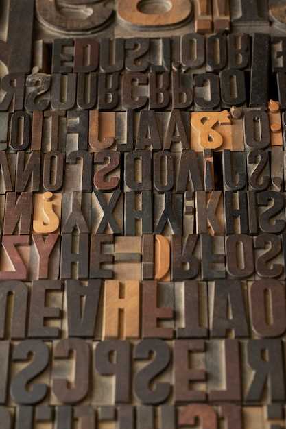
Typography, the art of arranging and designing type, plays a pivotal role in conveying messages and evoking emotions. It is a powerful tool that can transform a simple text into a captivating visual experience. By carefully selecting fonts, designers have the ability to enhance the impact and effectiveness of their communication, capturing the attention of the audience and leaving a lasting impression.
Typography is not just about choosing a font; it is about understanding the nuances and subtleties of each typeface and using them strategically to convey meaning. The right font can evoke a sense of elegance, professionalism, or playfulness, while the wrong choice can create confusion or detract from the intended message. It is through the skillful combination of fonts that designers can create a harmonious and visually appealing composition that resonates with the viewer.
When selecting fonts, it is important to consider factors such as legibility, readability, and appropriateness for the intended audience and purpose. Fonts with strong, bold characteristics can convey a sense of authority and confidence, while delicate and flowing scripts can evoke a feeling of elegance and sophistication. Additionally, the use of contrasting fonts can create visual interest and hierarchy, guiding the viewer’s eye and emphasizing key elements.
Typography is not limited to printed materials; it is an integral part of digital design as well. In the digital realm, fonts can be further enhanced through the use of various effects, such as shadows, gradients, and animations. These techniques can add depth and dimension to the text, making it more engaging and interactive. However, it is important to exercise restraint and ensure that the effects do not overshadow the message or compromise readability.
In conclusion, typography is a powerful tool that can greatly enhance visual communication. By carefully selecting and combining fonts, designers can create compelling compositions that effectively convey their intended message. Whether in print or digital form, typography has the ability to captivate and engage the audience, leaving a lasting impression and making the communication truly impactful.
The Power of Typography in Visual Communication
Typography plays a pivotal role in the realm of visual communication, exerting a profound influence on the way messages are conveyed and received. Through the careful selection and arrangement of fonts, designers have the ability to evoke emotions, establish hierarchy, and enhance the overall impact of their visual compositions.
By harnessing the power of typography, designers can effectively capture the attention of their audience and guide their gaze towards key elements within a design. The choice of font style, size, and weight can communicate a range of emotions, from elegance and sophistication to playfulness and excitement. Each font possesses its own unique personality, allowing designers to infuse their creations with a distinct tone and character.
Typography also serves as a powerful tool for establishing hierarchy and organizing information within a visual composition. Through the use of different font sizes, weights, and styles, designers can emphasize important elements and guide the viewer’s eye through the intended reading path. This strategic use of typography ensures that the message is communicated effectively and that the intended information is easily understood and retained.
Furthermore, typography has the ability to enhance the overall impact and legibility of a design. The careful selection of fonts that complement each other and align with the overall aesthetic of the composition can create a harmonious visual experience. On the other hand, inappropriate font choices can lead to confusion and hinder the communication process.
In conclusion, typography is a powerful tool that significantly influences visual communication. Through the deliberate selection and arrangement of fonts, designers can evoke emotions, establish hierarchy, and enhance the overall impact of their designs. By understanding the power of typography, designers can effectively convey their intended message and create visually compelling compositions.
Understanding the Role of Fonts in Design

In the world of design, fonts play a crucial role in conveying messages and evoking emotions. They are more than just a collection of letters; fonts have the power to shape the perception of a design and enhance its overall impact. By carefully selecting and utilizing fonts, designers can effectively communicate their intended message and create a visually appealing experience for the audience.
Fonts have the ability to convey various tones and moods, ranging from formal and professional to playful and whimsical. The choice of font can influence how a design is perceived and interpreted by the viewer. A bold and strong font may convey a sense of power and authority, while a delicate and elegant font may evoke a feeling of sophistication and grace. The use of different fonts can also help differentiate between different sections or elements within a design, guiding the viewer’s attention and creating hierarchy.
Furthermore, fonts can contribute to the overall cohesiveness and consistency of a design. By using a consistent set of fonts throughout a project, designers can establish a visual identity and create a sense of unity. This consistency helps to reinforce the message and branding of a design, making it more memorable and recognizable.
Typography, the art and technique of arranging type, goes beyond the mere selection of fonts. It involves careful consideration of factors such as font size, spacing, and alignment. These elements can greatly impact the readability and legibility of a design, ensuring that the message is effectively communicated to the audience. Proper typography can enhance the overall user experience and make the design more accessible to a wider range of viewers.
In conclusion, fonts are a powerful tool in design, capable of influencing the perception, emotion, and overall effectiveness of a visual communication. By understanding the role of fonts and utilizing them effectively, designers can create impactful designs that resonate with their intended audience.
Choosing the Right Typeface for Your Message
When it comes to conveying your message effectively, the choice of typeface plays a crucial role. The typeface you select can greatly impact how your message is perceived and understood by your audience. It is important to carefully consider the characteristics of different typefaces and choose the one that best aligns with the tone and purpose of your message.
One of the key factors to consider when selecting a typeface is its readability. The typeface should be easy to read and comprehend, ensuring that your message is conveyed clearly. Additionally, the typeface should be appropriate for the medium through which your message will be communicated. Whether it is a printed document, a website, or a presentation, the typeface should be legible and visually appealing in that specific context.
Another aspect to consider is the personality and tone that the typeface conveys. Different typefaces have distinct characteristics that can evoke specific emotions or associations. For example, a bold and modern typeface may be suitable for a contemporary and edgy message, while a classic and elegant typeface may be more appropriate for a formal and sophisticated message. By selecting a typeface that aligns with the desired tone, you can enhance the overall impact of your message.
Furthermore, it is important to consider the target audience when choosing a typeface. Different typefaces may resonate differently with different demographics. For instance, a playful and whimsical typeface may appeal to a younger audience, while a clean and minimalist typeface may be more appealing to a professional audience. Understanding your target audience and their preferences can help you make an informed decision about the typeface that will effectively communicate your message.
In conclusion, choosing the right typeface for your message is a critical aspect of visual communication. By considering factors such as readability, appropriateness for the medium, personality and tone, and the target audience, you can make an informed decision that enhances the impact and effectiveness of your message.
The Impact of Font Size and Weight on Readability
Exploring the Influence of Font Size and Weight on Readability
When it comes to effectively conveying information through typography, the choice of font size and weight plays a crucial role in enhancing readability. The size and weight of a font can significantly impact how easily the text can be comprehended and absorbed by the reader. Understanding the relationship between font size, weight, and readability is essential for designers and communicators alike.
Font size refers to the relative measurement of the characters in a typeface. It determines how large or small the text appears on a page or screen. The size of the font directly affects the legibility of the content, as it determines the space between letters and lines. A larger font size can improve readability for individuals with visual impairments or when reading from a distance, while a smaller font size may be suitable for compact designs or when conveying a sense of elegance.
Font weight, on the other hand, refers to the thickness or heaviness of the characters in a typeface. It influences the visual weight of the text and can evoke different emotions or convey specific meanings. A bold or heavy font weight can add emphasis and draw attention to important information, while a lighter weight can create a more delicate and subtle impression. The choice of font weight should align with the overall tone and purpose of the communication.
When considering the impact of font size and weight on readability, it is crucial to strike a balance between legibility and aesthetics. While larger font sizes may enhance readability, using excessively large sizes can lead to a cluttered and overwhelming visual experience. Similarly, while bold font weights can add emphasis, using them excessively can make the text appear heavy and difficult to read. Designers must carefully consider the target audience, context, and intended message to make informed decisions about font size and weight.
In conclusion, font size and weight are essential factors in determining the readability and effectiveness of visual communication. By understanding the relationship between these elements and making informed choices, designers can enhance the overall impact of their typography and ensure that their message is effectively conveyed to the audience.
Combining Fonts for a Harmonious Design
Creating a visually appealing design involves more than just choosing the right colors and layout. Typography plays a crucial role in enhancing the overall aesthetic and communication of a design. When it comes to selecting fonts, it is important to consider how different typefaces can work together harmoniously to convey the intended message effectively.
Combining fonts in a design requires a thoughtful approach to ensure that they complement each other and create a cohesive visual experience. By carefully selecting fonts with distinct characteristics, such as serif and sans-serif, designers can create a harmonious balance that adds depth and interest to their work.
One effective way to combine fonts is by using contrasting styles. Pairing a bold and attention-grabbing font with a more subtle and elegant one can create a visually striking contrast that captures the viewer’s attention. This combination can be particularly effective when used for headings and subheadings, as it helps to establish a clear hierarchy and guide the reader’s eye through the content.
Another approach to combining fonts is by focusing on their overall mood and tone. Fonts can evoke different emotions and convey specific messages. By selecting fonts that align with the desired mood of the design, designers can enhance the overall visual communication. For example, pairing a playful and whimsical font with a clean and modern one can create a design that is both fun and professional.
When combining fonts, it is important to consider their legibility and readability. Fonts should be easy to read, even at different sizes and in various contexts. It is advisable to test the chosen fonts in different scenarios to ensure that they maintain their clarity and legibility. Additionally, designers should pay attention to the spacing and alignment of the text to ensure that the combination of fonts does not create visual clutter or confusion.
In conclusion, combining fonts is an art form that requires careful consideration and experimentation. By selecting fonts that complement each other in terms of style, mood, and legibility, designers can create a harmonious design that enhances the visual communication of their work.
Typography Trends: Exploring Modern Font Styles
In this section, we will delve into the latest trends in typography, focusing on the exploration of modern font styles. By examining the evolving landscape of typography, we can gain insights into the diverse range of font choices that are currently shaping visual communication.
1. Minimalist Fonts
One prominent trend in modern typography is the use of minimalist fonts. These fonts are characterized by their simplicity and clean lines, often devoid of any decorative elements. Minimalist fonts offer a sleek and contemporary aesthetic, making them popular choices for websites, branding, and editorial design.
2. Handwritten and Script Fonts
Another trend that has gained traction in recent years is the use of handwritten and script fonts. These fonts mimic the appearance of handwritten text, adding a personal and authentic touch to designs. Handwritten and script fonts are often used in branding, invitations, and other creative projects where a sense of individuality and warmth is desired.
| Typography Trend | Description |
|---|---|
| 1. Minimalist Fonts | Characterized by simplicity and clean lines, devoid of decorative elements. |
| 2. Handwritten and Script Fonts | Mimic the appearance of handwritten text, adding a personal and authentic touch. |
These are just a few examples of the typography trends that are currently shaping the design world. By staying informed about the latest font styles, designers can make informed choices that enhance visual communication and create impactful designs.