
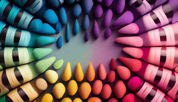
When it comes to the visual world, certain shades have the power to evoke profound feelings and elicit specific behaviors. The way we perceive and respond to colors is not merely a matter of personal preference, but rather a complex interplay between our minds and the environment. Understanding the psychology behind color selection in design can unlock a whole new level of impact and effectiveness.
Delving into the realm of chromatic influence, we discover that each hue possesses its own unique set of characteristics and associations. From the fiery passion of scarlet to the tranquil serenity of azure, colors have the ability to communicate messages and trigger responses on a subconscious level. By harnessing this knowledge, designers can strategically manipulate the emotional and behavioral responses of their audience.
Exploring the spectrum of human emotions is a fascinating journey that reveals the intricate relationship between color and mood. Warm tones like golden yellow and vibrant orange tend to evoke feelings of happiness, energy, and optimism. On the other hand, cool shades such as soothing green and calming blue often elicit a sense of tranquility, relaxation, and trust. By carefully selecting the appropriate color palette, designers can create an atmosphere that aligns with the desired emotional state.
The Power of Color: How it Influences Our Emotions
Exploring the profound impact of hues on our emotional state and well-being unveils a fascinating realm of human perception. Colors possess an extraordinary ability to evoke a wide range of emotions within us, shaping our experiences and influencing our daily lives. By delving into the intricate connections between color and emotion, we can gain a deeper understanding of how our surroundings can affect our mood, behavior, and overall psychological state.
When we encounter vibrant shades, they have the potential to ignite feelings of joy, enthusiasm, and excitement. On the other hand, more subdued tones can evoke a sense of calmness, tranquility, and relaxation. The emotional response to color is not only subjective but also influenced by cultural and personal associations. For instance, while red may symbolize passion and love in one culture, it may represent danger or anger in another.
Furthermore, the impact of color on our emotions extends beyond mere visual perception. Studies have shown that certain colors can stimulate physiological responses, such as increased heart rate or blood pressure. Warm colors like red and orange tend to be more stimulating, while cool colors like blue and green have a more soothing effect. These physiological reactions can further influence our behavior, affecting our decision-making, productivity, and even appetite.
Understanding the power of color in influencing our emotions can be particularly valuable in various design disciplines. In interior design, for example, specific color schemes can be strategically employed to create desired atmospheres and evoke specific emotions. Similarly, in marketing and branding, color choices can significantly impact consumer perception and influence purchasing decisions.
In conclusion, the influence of color on our emotions is a captivating phenomenon that permeates our daily lives. By recognizing the power of color and its ability to shape our emotional experiences, we can harness its potential to create environments that promote well-being, enhance productivity, and evoke desired emotional responses.
Red: The Color of Passion and Energy
Red, a vibrant and dynamic hue, is often associated with intense emotions and a powerful sense of energy. It has the ability to evoke feelings of passion, excitement, and enthusiasm. This captivating color has been used throughout history to convey a range of emotions and messages, making it a popular choice in various forms of art and design.
When it comes to psychology, red is often linked to strong emotions such as love, desire, and anger. It can stimulate the senses and increase heart rate, creating a sense of urgency and intensity. This makes it an ideal color to use in designs that aim to grab attention and create a sense of excitement or urgency.
In addition to its emotional impact, red is also associated with physical energy and strength. It is often used to represent power, courage, and determination. In sports, red is frequently used to symbolize energy and competitiveness, motivating athletes to push their limits and strive for victory.
Red can also have cultural and symbolic meanings. In some cultures, it is associated with luck, prosperity, and celebration. In others, it may symbolize danger, warning, or even revolution. These cultural associations can further enhance the impact of red in design, allowing it to communicate specific messages and evoke specific responses.
When incorporating red into design, it is important to consider its intensity and context. While a bold and vibrant red can create a strong impact, it may also be overwhelming if used excessively. Pairing red with complementary colors or using it as an accent can help create balance and enhance its overall effect.
| Positive Associations | Negative Associations |
|---|---|
| Passion | Anger |
| Energy | Aggression |
| Love | Danger |
| Excitement | Warning |
| Power | Revolution |
In conclusion, red is a color that exudes passion, energy, and intensity. Its ability to evoke strong emotions and convey powerful messages makes it a valuable tool in design. Whether used to create a sense of urgency, represent physical strength, or communicate cultural symbolism, red has the power to captivate and engage viewers.
Blue: The Calming Effect and Boosting Productivity
Blue, a color known for its calming properties and ability to enhance productivity, has a significant impact on mood and behavior. This article explores the psychological effects of blue and how it can positively influence individuals in various settings.
When surrounded by shades of blue, individuals often experience a sense of tranquility and relaxation. The color has the power to create a serene environment, promoting a peaceful state of mind. Whether it is the deep blue of the ocean or the soft blue of the sky, this color evokes a feeling of calmness and stability.
Moreover, blue has been found to boost productivity and focus. It stimulates the mind, enhancing cognitive abilities and promoting mental clarity. When used in workspaces or study areas, blue can help individuals stay focused and motivated, leading to increased efficiency and productivity.
Blue is also associated with trust and reliability. It is often used in corporate logos and branding to convey a sense of professionalism and dependability. This color instills a feeling of confidence and credibility, making it an ideal choice for businesses and organizations.
Additionally, blue has been linked to feelings of loyalty and responsibility. It is often associated with qualities such as loyalty, honesty, and integrity. Incorporating blue into personal or professional settings can help foster a sense of trust and loyalty among individuals.
Overall, the calming effect and productivity-boosting properties of blue make it a valuable color in design. Whether it is used in interior design, branding, or personal spaces, blue has the ability to positively influence mood and behavior, creating a harmonious and productive environment.
Yellow: The Color of Happiness and Optimism
Yellow, often associated with sunshine and warmth, is a color that exudes happiness and optimism. It has the power to uplift moods and evoke feelings of joy and positivity. In the realm of design, yellow can be a powerful tool to create a vibrant and energetic atmosphere.
The Symbolism of Yellow
Yellow is often associated with concepts such as happiness, joy, and optimism. It is a color that can instantly grab attention and create a sense of excitement. Just like the sun, yellow radiates warmth and positivity, making it an ideal choice for designs that aim to evoke feelings of happiness and cheerfulness.
The Psychological Impact of Yellow
Psychologically, yellow has been found to stimulate mental activity and increase focus. It can enhance creativity and promote a sense of enthusiasm. Yellow is also known to have an uplifting effect on mood, helping to combat feelings of sadness or depression. Its vibrant and energetic nature can inspire feelings of confidence and optimism.
When used in design, yellow can be a powerful tool to create a positive and engaging user experience. It can be used strategically to draw attention to important elements or to create a sense of excitement and energy. However, it is important to use yellow in moderation, as excessive use can be overwhelming and may lead to feelings of anxiety or irritation.
In conclusion, yellow is a color that symbolizes happiness and optimism. Its psychological impact can uplift moods, enhance creativity, and promote a sense of confidence. When used thoughtfully in design, yellow can create a vibrant and energetic atmosphere that evokes feelings of joy and positivity.
Green: The Symbol of Nature and Relaxation
Green, a color associated with nature and relaxation, has a profound impact on our mood and behavior. It is often used in design to create a sense of tranquility and harmony. The symbolism of green extends beyond its visual appeal, as it is deeply rooted in our subconscious and evokes feelings of renewal, growth, and balance.
The Symbolism of Nature
Green is closely associated with nature, representing the lushness of forests, the vibrancy of grass, and the serenity of meadows. It is the color of life itself, symbolizing growth, fertility, and rejuvenation. Just as nature thrives in green, so do we feel a sense of vitality and connection when surrounded by this color.
The Calming Effect
Green has a calming effect on our minds and bodies, making it an ideal color for spaces where relaxation is desired. It has been found to reduce stress and anxiety, promoting a sense of tranquility and peace. Whether it is a green room in a spa or a park filled with lush greenery, the color green has the power to soothe and rejuvenate.
- Green is often used in healthcare settings to create a calming and healing environment.
- Studies have shown that exposure to green spaces can improve mental well-being and enhance cognitive function.
- Green is also associated with balance and harmony, making it a popular choice in interior design.
Overall, green is a powerful color that symbolizes nature and relaxation. Its presence in our surroundings can have a profound impact on our mood and behavior, promoting a sense of tranquility and connection to the natural world. Incorporating green into design can create spaces that are not only visually appealing but also conducive to relaxation and well-being.
Purple: The Color of Creativity and Luxury
Purple, a hue associated with imagination and opulence, has long been revered for its ability to evoke feelings of creativity and luxury. This regal color, often associated with royalty and nobility, has a profound impact on our emotions and behaviors.
When we think of purple, we envision a color that is both rich and mysterious. It exudes an air of sophistication and elegance, making it a popular choice in high-end fashion and interior design. The deep tones of purple can create a sense of depth and richness, while lighter shades can evoke a feeling of tranquility and serenity.
Psychologically, purple is known to stimulate the imagination and inspire creativity. It encourages us to think outside the box and explore new ideas. This makes it an ideal color choice for artists, writers, and innovators who seek to push boundaries and challenge conventional thinking.
Furthermore, purple has a unique ability to evoke a sense of luxury and indulgence. It is often associated with wealth and extravagance, making it a popular choice for branding and marketing in industries such as cosmetics, jewelry, and high-end products. The use of purple in these contexts not only conveys a sense of exclusivity but also appeals to our desire for self-expression and personal indulgence.
In conclusion, purple is a color that embodies both creativity and luxury. Its ability to stimulate the imagination and evoke feelings of opulence makes it a powerful tool in design and branding. Whether used in fashion, interior design, or marketing, purple has the potential to captivate and inspire, leaving a lasting impression on our mood and behavior.